Integration of BCR and GEX Data
Introduction
BCR (B cell receptor) data and GEX (gene expression) data can borrow information from each other for expanded analyses. This tutorial demonstrates several approaches to integrating these data types along with examples on how the new information can be used.
The example files used in this tutorial are subsamples of the original 10x scRNA-seq and BCR sequencing data from Turner et al. (2020) Human germinal centres engage memory and naive B cells after influenza vaccination. The study consists of blood and lymph node samples taken from a single patient at multiple time points following influenza vaccination.
We extracted a subset (~3000 cells) of single cell GEX/BCR data of ultrasound-guided fine needle aspiration (FNA) samples of lymph nodes for subject P05.
These 3000 cells were randomly divided into two pseudo-subjects, ensuring that each subject has distinct clones while maintaining a similar clone size distribution.
The example data is already in the container (
/home/magus/data/). If you want to, you can download it from Zenodo .
.We will use these files in particular for this tutorial:
BCR.data_08112023.rds: R dataframe object containing the single-cell BCR sequencing data.
GEX.data_08112023.rds: Gene expression data in the form of a Seurat object. Processing and annotation steps are not covered in this tutorial. You can learn more on these topics in Seurat’s documentation and tutorials: https://satijalab.org/seurat/articles/pbmc3k_tutorial.html
Cell type abbreviations: DC = dendritic cells, GC B = germinal center B cells, NK = natural killer cells, PB = plasmablasts, RMB = resting memory B cells.
Please note that in the code blocks that follow, # denote comments,
## denote code outputs and plain text is the code itself. This allows
you to copy/paste as needed. You may have to alter the code in this
tutorial if you are not using 10x Genomics data or prefer a different
single-cell system other than Seurat (such as
SingleCellExperiment
or scverse).
# make sure the environment is clear of user objects
# note that custom set working directories, loaded libraries, etc. will be unaffected
# you may need to fully restart R for reproducibility
rm(list = ls())

# show some useful information
cat(R.Version()$version.string,
    paste("Platform:", R.Version()$platform),
    paste("Running under:", sessionInfo()$running),
    sep = "\n")

## R version 4.3.2 (2023-10-31)
## Platform: x86_64-redhat-linux-gnu
## Running under: Fedora Linux 38 (Container Image)

# cat("\n")

# load the required packages
packages <- c("dplyr", "ggplot2", "Seurat")
for (n in seq_along(packages)) {
  suppressPackageStartupMessages(library(packages[n], character.only = TRUE))
  cat(paste0(packages[n], ": ", packageVersion(packages[n]), "\n"))
}

## dplyr: 1.1.4
## ggplot2: 3.4.4
## Seurat: 5.0.1

# set the data directory
path_data <- file.path("", "home", "magus", "data") # change this to fit your own structure
# so that the plots are consistent
set.seed(42)
In this tutorial, we will integrate the BCR and GEX data by using the
cell barcodes. However, since cell barcodes can be duplicated in
multiple samples, we suggest concatenating the sample ids with the
cell ids in order to ensure the uniqueness of cell barcodes across
multiple samples. The sample ids can be added as a prefix to the
existing cell ids when the GEX data is being processed with a Seurat
command such as
gex_obj <- RenameCells(object = gex_obj, add.cell.id = sample).
Note: We have already added the sample ids to the cell ids as such in
the example GEX data. We have also renamed c_call to c_gene.
# read in the data
gex_obj <- readRDS(file.path(path_data, "GEX.data_08112023.rds"))
bcr_data <- readRDS(file.path(path_data, "BCR.data_08112023.rds"))

# examine the GEX data
gex_obj

## An object of class Seurat
## 19293 features across 3729 samples within 1 assay
## Active assay: RNA (19293 features, 1721 variable features)
##  1 layer present: data
##  2 dimensional reductions calculated: pca, umap

names(gex_obj@commands) # the Seurat processing steps run on this data

## [1] "ScaleData.RNA"            "FindVariableFeatures.RNA"
## [3] "RunPCA.RNA"               "RunUMAP.RNA.pca"
## [5] "FindNeighbors.RNA.pca"    "FindClusters"

# make sure that the GEX object has the unique cell ids in the metadata
names(gex_obj[[]])

##  [1] "orig.ident"     "nCount_RNA"     "nFeature_RNA"   "sampleType"
##  [5] "day"            "percent.mt"     "cell_id"        "subject"
##  [9] "sample"         "cell_id_unique"

# gex_obj$cell_id_unique <- Cells(gex_obj) # assuming you made them unique already, see above

# examine a few select columns of the BCR data
bcr_data %>%
  ungroup %>%
  select(day, sample, cell_id, cell_id_unique, v_call, j_call, c_gene) %>%
  slice_sample(n = 5)

## # A tibble: 5 x 7
##     day sample                cell_id        cell_id_unique v_call j_call c_gene
##   <int> <chr>                 <chr>          <chr>          <chr>  <chr>  <chr>
## 1     0 subject1_FNA_d0_2_Y1  ATTATCCAGACAT~ subject1_FNA_~ IGHV3~ IGHJ2~ IGHA
## 2     5 subject1_FNA_d5_2_Y1  GACTGCGTCGTAG~ subject1_FNA_~ IGLV5~ IGLJ2~ IGLC2
## 3     0 subject2_FNA_d0_1_Y1  AGCCTAAGTATAT~ subject2_FNA_~ IGHV1~ IGHJ6~ IGHG
## 4    60 subject2_FNA_d60_1_Y1 CACATAGAGTACT~ subject2_FNA_~ IGKV4~ IGKJ1~ IGKC
## 5    60 subject1_FNA_d60_1_Y1 CATCGAAAGGCAG~ subject1_FNA_~ IGHV1~ IGHJ5~ IGHG

# make sure that there are no empty c_gene rows
bcr_data <- bcr_data %>% dplyr::filter(!is.na(c_gene), c_gene != "")

# define custom colors for the cell types (for plotting later)
cols_anno <- c("ABC" = "green", "GC" = "dodgerblue2", "Naive" = "darkgoldenrod2",
               "PB" = "firebrick2", "RMB" = "plum2")

# define custom themes for plotting
labels_standard <- theme_bw() + theme(plot.title = element_text(hjust = 0.5))
clean_umap <- theme(axis.text = element_blank(),
                    axis.ticks = element_blank(),
                    aspect.ratio = 1)
The GEX data used here has already had cell types annotated (using
characteristic marker genes). We suggest creating a column in the
object’s metadata to store these annotations
e.g. gex_obj$annotated_clusters <- Idents(gex_obj) (if the annotations
are the active.ident).
gex_obj$annotated_clusters <- Idents(gex_obj)
Alphabetize the cell types within the GEX if desired:
# useful for plotting
gex_obj$annotated_clusters <-
  factor(gex_obj$annotated_clusters,
         levels = sort(levels(gex_obj$annotated_clusters)))

# if you have a numerical component to your cluster names, you may want to use something like stringr::str_sort(..., numeric = TRUE) to have them alphabetize properly aka alphanumerically
Integration of BCR data with the GEX Seurat object
The meta.data data slot in the Seurat object contains metadata for
each cell and is a good place to hold information from BCR data.
For example, we can indicate if a cell in the GEX data has a corresponding BCR or not by adding a column called
contains_bcr.If the column
contains_bcris valid, then we can add other useful BCR data information such as clonal lineage, mutation frequency, isotype, etc. to themeta.dataslot.
Note that you can only match information to one cell at a time in the Seurat object. This means that you cannot integrate both the heavy chain and the light chain information for a cell. We suggest only adding in the heavy chain information.
Make sure to check that all of your heavy chains had a
c_geneassigned e.g. withdplyr::filter(bcr_data, is.na(c_gene)).
Check barcode styles
Sometimes analysts will remove the GEM well indicating suffixes
(e.g. “-1”) from barcodes when they first read in the initial data
e.g. with Read10X(..., strip.suffix = TRUE). If this has been done,
you must ensure that the same is done with your AIRR data so that you
can properly match up the barcodes for the following integration step.
# let's see what our GEX barcodes look like
head(Cells(gex_obj))

## [1] "subject2_FNA_d60_1_Y1_GCGACCAGTTGGAGGT-1"
## [2] "subject1_FNA_d60_2_Y1_GCATGCGAGCCACTAT-1"
## [3] "subject1_FNA_d60_1_Y1_TGACGGCTCGTACCGG-1"
## [4] "subject2_FNA_d60_1_Y1_GTTTCTATCAACCAAC-1"
## [5] "subject1_FNA_d0_2_Y1_AACTCAGAGGAATCGC-1"
## [6] "subject2_FNA_d0_2_Y1_CTAGAGTTCAGTCAGT-1"

# now let's look at the BCR barcodes
head(bcr_data$cell_id_unique)

## [1] "subject2_FNA_d60_1_Y1_GCGACCAGTTGGAGGT-1"
## [2] "subject1_FNA_d60_1_Y1_GTGCTTCTCTGTCTCG-1"
## [3] "subject1_FNA_d60_2_Y1_GCATGCGAGCCACTAT-1"
## [4] "subject1_FNA_d60_1_Y1_TGACGGCTCGTACCGG-1"
## [5] "subject2_FNA_d60_1_Y1_GTTTCTATCAACCAAC-1"
## [6] "subject1_FNA_d0_2_Y1_AACTCAGAGGAATCGC-1"
Our data here matches up, but if it hadn’t, we could have run a command
such as
bcr_data %>% tidry::separate(cell_id_unique, sep = "-", into = "cell_id_unique_formatted", remove = FALSE, extra = "drop")
to create a new column called “cell_id_unique_formatted” (or whatever
you’d like to call it, you could even just replace the original column)
without the suffixes.
Create the new metadata columns
# match by using the unique cell ids
new_meta_cols <- data.frame(cell_id_unique = Cells(gex_obj))

# only add in the heavy chains (otherwise the row counts differ)
bcr_data_selected <- dplyr::filter(bcr_data, locus == "IGH")

# select columns from BCR data
bcr_data_selected <- bcr_data_selected %>%
                       select(cell_id_unique, clone_id, mu_freq, c_gene) %>%
                       rename(Isotype = c_gene)

# sort BCR data by cell id in GEX Seurat Object
new_meta_cols <- left_join(new_meta_cols, bcr_data_selected,
                           by = "cell_id_unique")

# integrate BCR data with the Seurat object
for (colname in colnames(bcr_data_selected)) {
  gex_obj[[colname]] <- new_meta_cols[[colname]]
}
gex_obj$contains_bcr <- !is.na(gex_obj$clone_id)

# examples of the new columns
ncol_meta <- ncol(gex_obj[[]])
gex_obj[[]][, (ncol_meta - 3):ncol_meta] %>%
  dplyr::filter(contains_bcr) %>% # let's look at the ones that match with BCRs
  slice_sample(n = 5) # row names = cell ids

##                                          clone_id    mu_freq Isotype
## subject2_FNA_d60_1_Y1_GGAAAGCGTATCTGCA-1    18599 0.10416667    IGHG
## subject1_FNA_d60_2_Y1_GGGTTGCGTCATACTG-1   129238 0.11458333    IGHA
## subject2_FNA_d60_1_Y1_TGAGCATTCCCTCTTT-1    49068 0.06872852    IGHM
## subject2_FNA_d60_1_Y1_TACTTGTTCGGTCCGA-1   116918 0.02083333    IGHM
## subject2_FNA_d0_1_Y1_AGTGGGACAGTCACTA-1     40973 0.03819444    IGHM
##                                          contains_bcr
## subject2_FNA_d60_1_Y1_GGAAAGCGTATCTGCA-1         TRUE
## subject1_FNA_d60_2_Y1_GGGTTGCGTCATACTG-1         TRUE
## subject2_FNA_d60_1_Y1_TGAGCATTCCCTCTTT-1         TRUE
## subject2_FNA_d60_1_Y1_TACTTGTTCGGTCCGA-1         TRUE
## subject2_FNA_d0_1_Y1_AGTGGGACAGTCACTA-1          TRUE
Note: If you are also adding TCR information, be careful with the columns that you select as they may have the same names as BCR information. For example, if you had already added in a
v_callcolumn from BCR data, then adding the same column from TCR data will overwrite it. One possible solution to this is to use the columns as defined by the AIRR standard, but with a prefix added denoting the AIRR type e.g. “bcr_”.*
Examine integrated information
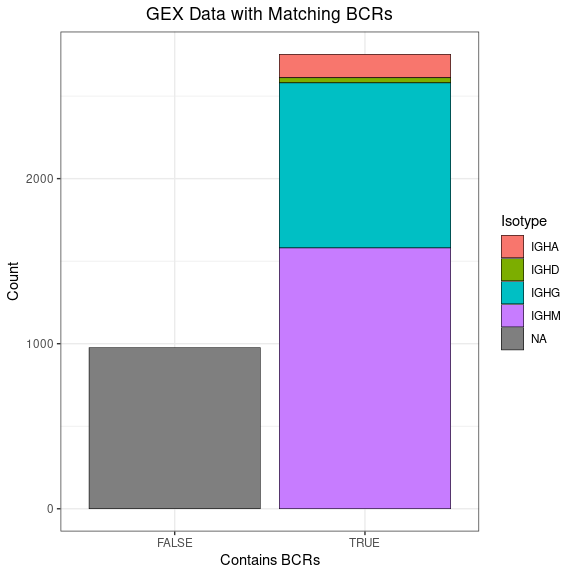
This bar plot shows how much of your GEX data has corresponding BCRs.
# you can fill by isotype to get a little more info
ggplot(gex_obj[[]], aes(x = contains_bcr, fill = Isotype)) +
  geom_bar(color = "black", linewidth = 0.2) +
  labs(title = "GEX Data with Matching BCRs",
       x = "Contains BCRs", y = "Count") +
  labels_standard
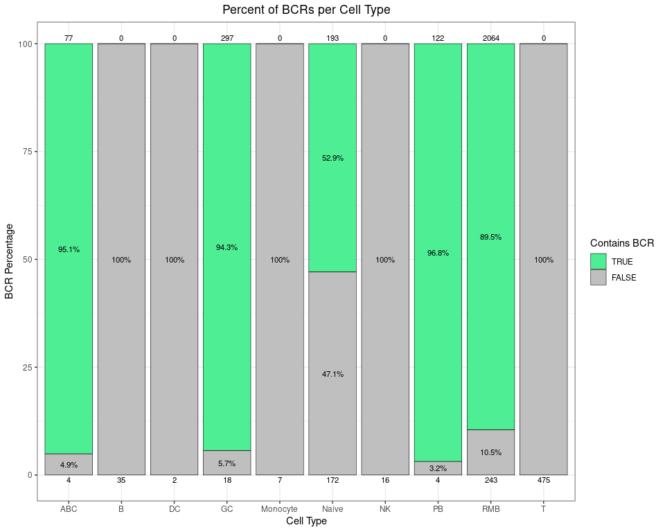
This stacked bar plot shows how much of the GEX data corresponds with BCRs broken down by cell type. You can see both the percentage and the raw counts on the top and bottom of each bar (since sometimes percentages can be misleading). For example, as expected, 100% of the 475 T cells do not have any corresponding BCRs.
# calculate the percentage of each cell type that has BCRs
pct_bcrs <- as.data.frame(table(gex_obj$contains_bcr,
                                gex_obj$annotated_clusters)) %>%
              rename(contains_bcr = Var1, annotated_clusters = Var2,
                     Count = Freq) %>%
              as_tibble() %>%
              group_by(annotated_clusters) %>%
              mutate(Percent = 100 * Count / sum(Count),
                     contains_bcr = factor(contains_bcr,
                                           levels = c(TRUE, FALSE)))

# make a stacked bar plot, with raw counts for each group on top/bottom
# you could use scales::label_percent to make the %'s nicer e.g. in the y axis
# change the label size, percent rounding, colors, etc. as desired
ggplot(data = pct_bcrs,
       aes(x = annotated_clusters, y = Percent, fill = contains_bcr)) +
  geom_bar(stat = "identity", color = "black", linewidth = 0.2) +
  labs(title = "Percent of BCRs per Cell Type",
       x = "Cell Type", y = "BCR Percentage", fill = "Contains BCR") +
  scale_fill_manual(values = c("TRUE" = "seagreen2", "FALSE" = "grey75"),
                    limits = force) +
  scale_y_continuous(expand = expansion(mult = 0.05)) +
  geom_text(aes(label = ifelse(Percent > 2, paste0(round(Percent, 1), "%"), NA),
                group = contains_bcr),
            size = 3, position = position_stack(vjust = 0.5)) +
  # counts on top
  geom_text(mapping = aes(label = ifelse(contains_bcr == TRUE, Count, "")),
            position = position_stack(), vjust = -0.5,
            color = "black", size = 3) +
  # counts on bottom
  geom_text(mapping = aes(label = ifelse(contains_bcr == FALSE, Count, ""),
                          y = -1),
            color = "black", size = 3) +
  labels_standard

## Warning: Removed 5 rows containing missing values (`geom_text()`).
Highlight BCR cells in the GEX UMAP
After we integrate the BCR data into the Seurat object, we can highlight BCR cells in a GEX UMAP plot to check if annotations based upon biomarker gene expression are accurate or not.
# have to set the idents
Idents(gex_obj) <- "annotated_clusters" # should be annotated

highlighted_cells <- Cells(gex_obj)[which(gex_obj$contains_bcr)]

# you could add a text box to the labels or repel them to make them easier to see
UMAPPlot(object = gex_obj, cells.highlight = highlighted_cells,
         label = TRUE, label.size = 5, pt.size = 0.7) +
  scale_color_manual(name = "Data Type",
                     labels = c("non-BCR", "BCR"),
                     values = c("gray", "red")) +
  labels_standard + clean_umap

## Scale for colour is already present.
## Adding another scale for colour, which will replace the existing scale.
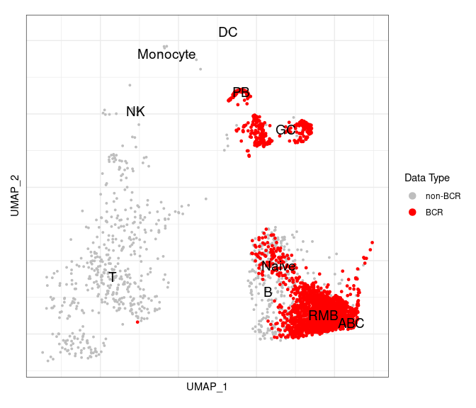
As we can see, there is a very good correlation between BCR cells with BCRs (in red) and the clusters labeled as B cells.
Integration of GEX cell annotations in the BCR data
The annotation information of B cells (such as sub-types of B cells and their associated UMAP coordinates) identified by the GEX data can be integrated into BCR data.
Add GEX information to the BCR data
# select columns from the GEX data
gex_data_selected <-
  data.frame(cell_id_unique = gex_obj$cell_id_unique,
             gex_umap_1 = gex_obj@reductions$umap@cell.embeddings[, 1],
             gex_umap_2 = gex_obj@reductions$umap@cell.embeddings[, 2],
             gex_annotation = gex_obj$annotated_clusters)

# integrate GEX data with the BCR data
bcr_gex_data <- left_join(bcr_data, gex_data_selected,
                          by = "cell_id_unique")

# keep BCR cells with matched GEX cells (assuming everything was annotated)
bcr_gex_data <- dplyr::filter(bcr_gex_data, !is.na(gex_annotation))

# examples of the new columns
ncol_bcr_gex <- ncol(bcr_gex_data)
bcr_gex_data[, (ncol_bcr_gex - 3):ncol_bcr_gex] %>% slice_sample(n = 5)

## # A tibble: 5 x 4
##   subject  gex_umap_1 gex_umap_2 gex_annotation
##   <chr>         <dbl>      <dbl> <fct>
## 1 subject1       7.26     -4.29  RMB
## 2 subject1       9.01     -3.00  RMB
## 3 subject1      11.2      -4.39  ABC
## 4 subject2       6.28     -0.663 Naive
## 5 subject2       8.81     -3.88  RMB
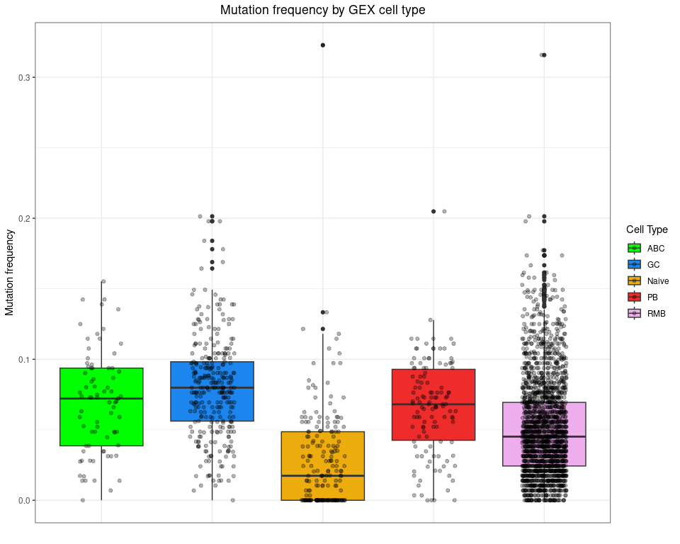
Plot mutation frequency by cell type
ggplot(bcr_gex_data,
       aes(y = mu_freq, x = gex_annotation, fill = gex_annotation)) +
  geom_boxplot() +
  geom_jitter(width = 0.2, alpha = 0.3) +
  scale_fill_manual(values = cols_anno) +
  labs(title = "Mutation frequency by GEX cell type",
       x = "", y = "Mutation frequency", fill = "Cell Type") +
  labels_standard +
  theme(axis.text.x = element_blank(), axis.ticks.x = element_blank())

## Warning: Removed 2922 rows containing non-finite values (`stat_boxplot()`).

## Warning: Removed 2922 rows containing missing values (`geom_point()`).
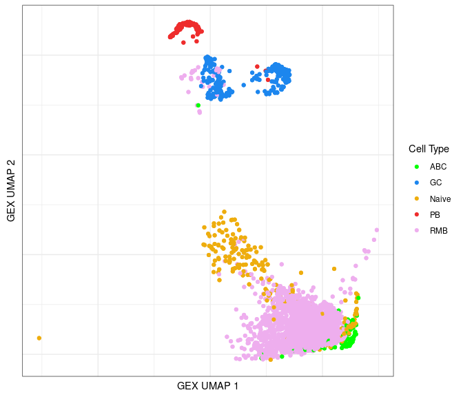
Identify GEX clusters in the BCR UMAP
Using the annotated information, we can lay out cells from the BCR data in a UMAP plot color-coded by the B cell subtypes.
ggplot(data = bcr_gex_data,
       aes(x = gex_umap_1, y = gex_umap_2, color = gex_annotation)) +
  geom_point() +
  labs(x = "GEX UMAP 1", y = "GEX UMAP 2") +
  scale_color_manual(name = "Cell Type", values = cols_anno) +
  labels_standard + clean_umap
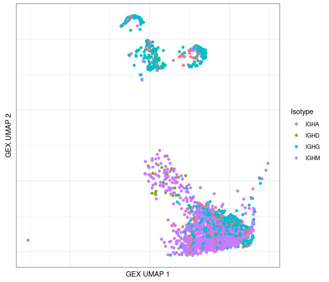
Plot by isotype:
# only plot the heavy chains
ggplot(data = dplyr::filter(bcr_gex_data, locus == "IGH"),
       aes(x = gex_umap_1, y = gex_umap_2, color = c_gene)) +
  geom_point() +
  labs(x = "GEX UMAP 1", y = "GEX UMAP 2", color = "Isotype") +
  labels_standard + clean_umap
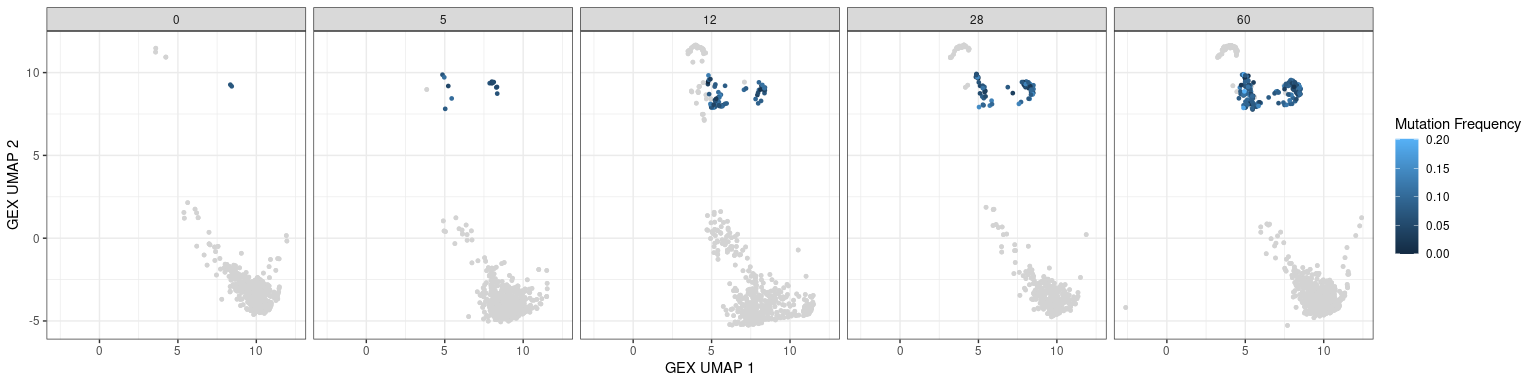
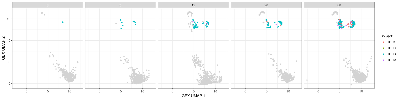
Other BCR features in UMAPs
Characteristics associated with the BCR can also be displayed in UMAP plots. The plots below show the mutation frequencies and isotypes of GC B cells at various time points.
# base plot
p <- ggplot(data = dplyr::filter(bcr_gex_data, gex_annotation != "GC"),
            aes(x = gex_umap_1, y = gex_umap_2)) +
       geom_point(color = "lightgray", size = 1) +
       labels_standard + facet_wrap(~day, nrow = 1)

# isotype information
p + geom_point(data = dplyr::filter(bcr_gex_data,
                                    gex_annotation == "GC"),
               aes(x = gex_umap_1, y = gex_umap_2, color = c_gene),
               size = 1) +
    labs(x = "GEX UMAP 1", y = "GEX UMAP 2")
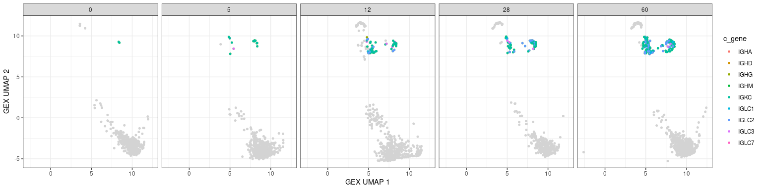
# heavy only
p + geom_point(data = dplyr::filter(bcr_gex_data, gex_annotation == "GC",
                                    locus == "IGH"),
               aes(x = gex_umap_1, y = gex_umap_2, color = c_gene),
               size = 1) +
    labs(x = "GEX UMAP 1", y = "GEX UMAP 2", color = "Isotype")
# mutation frequency
# heavy only
p + geom_point(data = dplyr::filter(bcr_gex_data, gex_annotation == "GC",
                                    locus == "IGH"),
               aes(x = gex_umap_1, y = gex_umap_2, color = mu_freq),
               size = 1) +
    labs(x = "GEX UMAP 1", y = "GEX UMAP 2", color = "Mutation Frequency")